Is How I See Color How You See Color? Two Games That Test Your Color Vision

Photographers typically spend a lot of time thinking about color, everything from editing in Photoshop, calibrating a screen, or lighting with gels and filters, to deciding on wardrobe, set design, and locations. There is no escaping the importance of color in this profession, and yet the way we see and describe color is not so simple. Color vision games can be a great way to test your perception of the world around you and compare that to fellow photographers.
How we see color gets complicated fast because it's determined by physics, biology, and culture. Differences in any one drastically changes your perception, giving you a different experience than someone else. On top of that, the brain can be tricked into convincing you that you are seeing one color when you are actually seeing another. There are so many variables to how any given viewer is seeing color, it makes you second guess all that time spent agonizing in Photoshop.
I have always been obsessed with the concept of color, even as a little kid reading the names on the bigger box of crayons and questioning the difference between them. Back then, I think there were 64 colors in the biggest box; now, there are 120. Have we really created that many new crayon colors? Later in life but before I became a photographer, I went to college for anthropology, and this was when my interest in color really took off.
Different cultures see more shades of a given color, while others don't see a difference between red and orange. The concept of brown as an individual color or a different color from black isn't universal.

When you get to the topic of communicating about what is seen as color, linguistics takes cultural differences to another level. One of the most common and interesting differences around the world is whether blue and green are different individual colors or different shades of the same color. Some languages like English use light and dark colors, like light blue and dark blue. In Russian, there is a different word for each. This may seem a very odd concept in the English world, but then we have red and pink, which to a lot of people is just red, and to others, dark red and light red.
Of course, a few languages don't have terms for colors at all and use words for things in their environment to describe colors, like "grass" for green or the name of a bird for yellow. This can lead to an understanding that all shades of green are just grass. An example of this in English is "orange," named after the fruit.
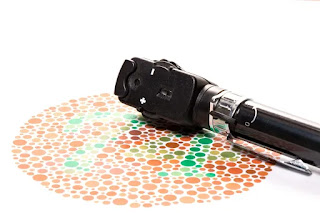
Then, there is the biology of how we see color. I wont go into detail about how the eye works, and most people are aware color blindness exists, but just between the average level of eyesight, individuals have different amounts of cones. This means some people can see more shades than others or more blues than reds from birth. Gender plays a role as well: men are more likely to have some kind of colorblindness than women. Some studies show that women tend to recognize more variations of a single color than men do.
For the most part, in our day-to-day lives, we seem to all know what the other is talking about, at least for photographers specifically interacting with a client or showing your work at a gallery. We will never really know if when they walk away, the color in a photograph was viewed the way you intended, and this probably doesn't matter. However, given the amount of time we spend pixel-peeping, testing camera sensors, and just debating which piece of gear or software does a better job ,maybe it's something we should think a little more about.

All this of course can be tested if even on a minor scale with a few fun little vision games. Try one or all of them out and post your results. Compare what you scored to other Fstoppers readers, and you will quickly see even in a specific field like photography that relies heavily on color, the scores will vary greatly.
Each one gets harder and more complicated, even adding a timer into it, but which game is harder will differ for each individual. I've put them in order of which I find easiest to hardest. I've been playing these games for years and often play them every few weeks or so to see if I still have good color vision.
They can be fun time-wasters or even a tool to see how well a random monitor I'm using is calibrated. It can be really fun to have your friends play them, especially if they don't typically work with color.
X-rite Color Challenge


Comments
Post a Comment